Incognito: Increasing the visibility of online privacy
It’s 2019, Incognito has launched its privacy scanning app, able to check for previously ‘undetectable’ spyware. The app’s impressive initial uptake is slowing, viewed by some as a single-use app, meaning user retention is low. Incognito needed to bring their service to a larger audience & motivate them to stay onboard.
Role: UI/UX & motion graphics designer
Duration: 4 years, Jan 19 - Dec 22
Apps: Figma, Ae, Lottie, Illustrator, Ps
The problem
Analytics & usage data proved that although users saw a great deal of value in the core offering, there was little reason for them to keep the app installed after their initial scan, whilst ‘pro’ memberships were almost non-existent.
The objective
To swiftly upgrade the UI & user experience, then redefine the app with new user-retention focused features which would encourage users to view Incognito as an essential component of their daily online security.
1: Research
With a wealth of user feedback from surveys, testing & the app store, backed up by usage data, I was armed with all the information I needed to form a solid impression of the challenges facing the app.
What were the core pain points & issues experienced by users with the current iteration of the app?
Why were many users uninstalling the app after performing a scan despite widely positive feedback?
What would it take to convince users to see the value in a premium subscription-based version?
After collating user feedback & usage data from a variety of sources, some key action points became clear:
Incognito didn’t offer ongoing protection like an anti-virus, so there was little motivation to keep it installed after a scan.
Users liked the simplicity of the app, but felt it was quite basic with poorly designed layouts & intrusive ad placement.
Users noted that expanding the offering to include more useful security features alongside privacy scan would increase the value proposition.
2: Conceptualize
Version 1.5
Incognito wanted to first focus on easy wins, upgrading the existing version of the app, refining the UI & optimizing features, fostering confidence in users. With the foundations in place, we were able to turn this around in under 3 months.
Upgraded & expanded the existing user interface, building a new polished main menu screen & scan process.
Addressed pain points with the user experience, with unattractive, inconsistent formatting & irritating ad block placement taking priority.
Redefined & created new templates for ‘privacy tip’ content. These daily web security articles had great promise, but were limited & not achieving their potential.
Defining version 2
Privacy score
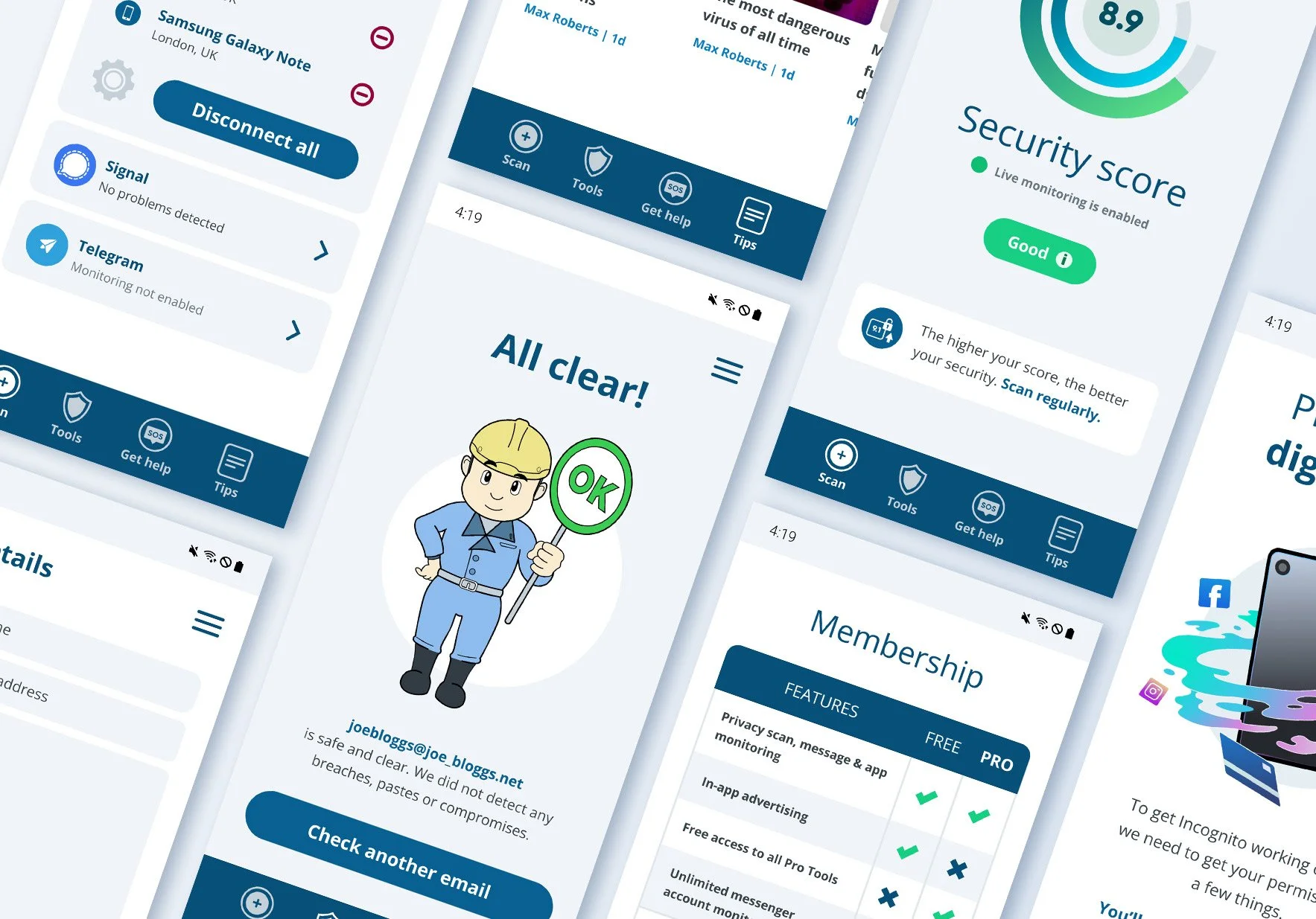
Version 2 would provide users with a new security score determined by factors including spyware, apps, dangerous messenger & WIFI connections. Ongoing monitoring would alert users if it changed suddenly.
Security tools
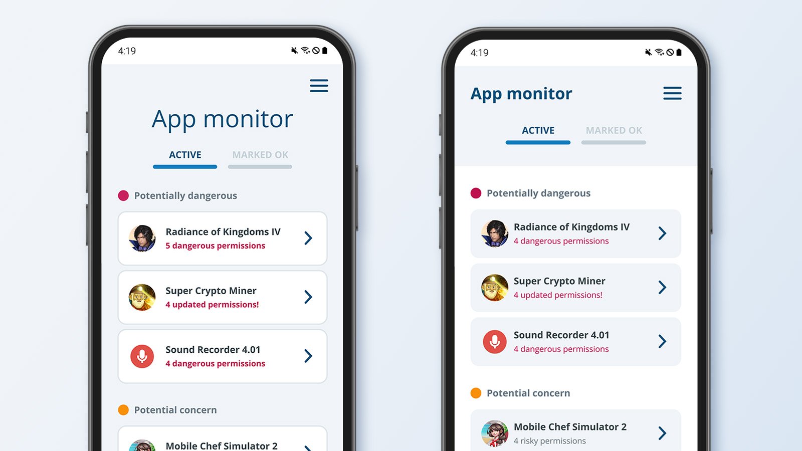
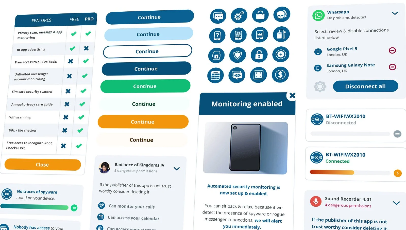
The company wanted to include monitoring for rogue messenger connections, dangerous apps/permissions & WIFI networks. These features would be available to all premium users or unlocked for x1 use via reward ads.
A fresh look
Version 2 would feature a brand-new inclusive look & totally new structure, with an enhanced, guided user experience at its heart.
3: Final designs
Mood boards
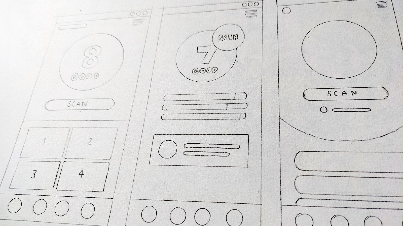
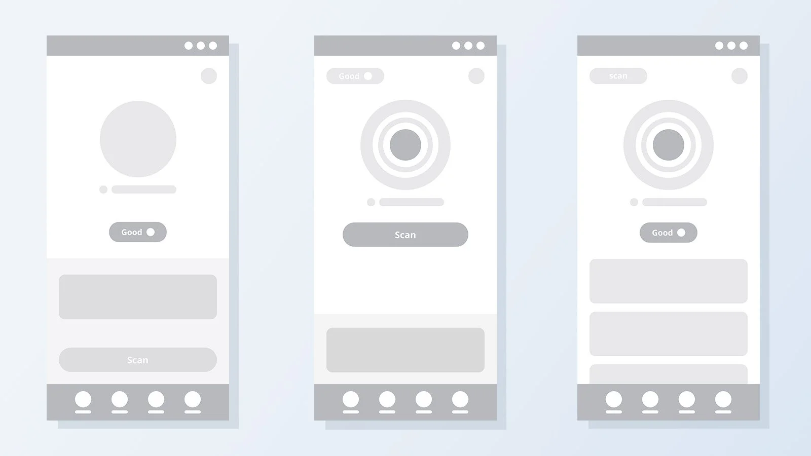
Once the initial wireframes were in place & the key functionality was being built. I began by building mood boards, taking inspiration from other web security & anti-virus apps, as well as references for trustworthy, clean, utilitarian user interfaces & apps.
Colour palette
With V2 we moved away from layouts which were predominantly black, white & grey, to the inverse, creating more accessible, spacious layouts that seemed less imposing. I retained the blue & orange colours from the original app, deriving a new palette from them.
Font choices
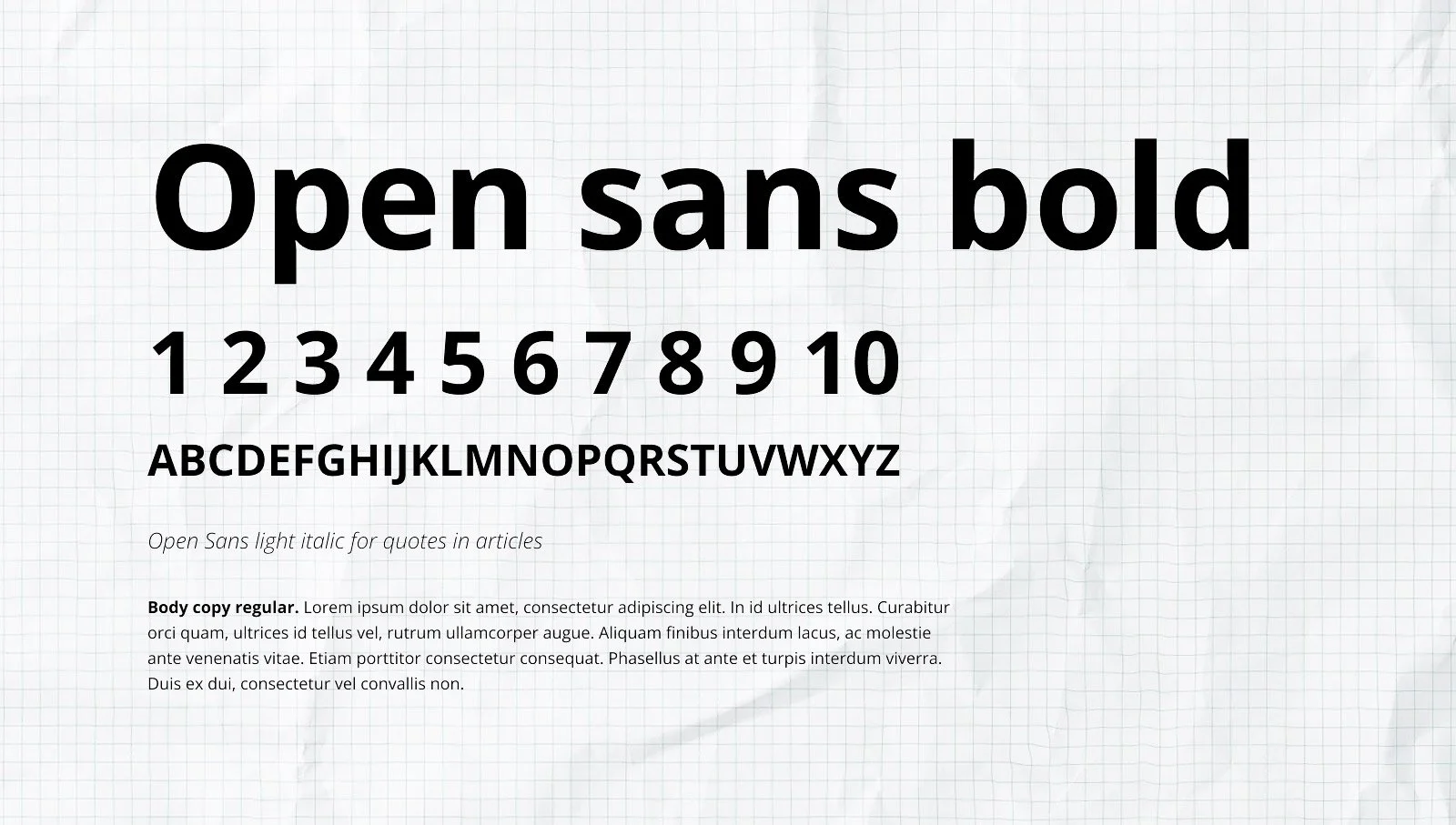
With Incognito we wanted to present a friendly, welcoming, but professional tone of voice. I settled on open sans for version 2.0. I felt the font family & its variety of styles was versatile enough to use it without paring it with another font.
Design system
I created a full design system & library of components for the dev team, featuring interactive states for elements such as buttons, check boxes & radio buttons. I used an 8-pixel grid to determine spacing scales & sizing of elements. (8,16, 24, 32 etc)
4: Outcomes
By 2022 we had doubled lifetime installs, going from just under 3 million in 2019 to almost 6 million. 10% increase in user retention & 5% for premium memberships.
By 2022 we entered the top 10% of ad-grossing apps in the Google app store & were provided access to an in-house Google UX team who approved V2 with only a handful of minor changes.
Due to continued success & growth I was made a shareholder in the company.
Reflections
I was the sole designer working on this project, so seeing it go from strength-to-strength was an incredibly fulfilling experience I am proud to have been part of.
Being granted the opportunity work with Google UX experts who received my work so enthusiastically was a very affirming & gratifying experience, which has allowed me to gain truly invaluable experience & confidence going forward.


