
Disruptive banking: The playful side of finance
As part of my certification in UI design from the UX Institute, we were assigned the task of creating a mobile banking app for a new disruptor brand. The mandate for this project was to create something clear & easy to navigate, with a playful style, but still feeling trustworthy enough to instill confidence in users.
Role: UI designer
Duration: 6 months, July 23 - Dec 23
Apps: Figma, Illustrator, Photoshop


The problem
Our fictitious new banking brand wanted to break into the disruptor banking market, bringing its own unique style into the mix. But how could we tread the line between a playful spirit & sparking confidence in our users?
The objective
To design key screens for an exciting new banking application, delivering fresh ideas & a unique confident personality, whilst feeling familiar enough to instill immediate confidence in users for mobile, tablet & desktop.
1: Research

References for ‘playful’
I looked for playful UI design references taking into account effective use of colour, shapes, curves, imagery & spacing. I collected together references which helped me to envision a range of different approaches to the project.
References for ‘clear’
Another aspect of the research phase was collecting references for clear layouts with effective use of well considered spacing. I chose designs that presented information clearly, with a spacious breezy feel.

References for colour
I researched UI designs that utilized clever use of colour with vibrant palettes full of character. This exercise allowed me to establish a number of different approaches towards the design of the application.

References for UI elements
I collected a library of references for design systems complete with numerous states. I looked for a variety of approaches which were both clear & functional, but vibrant, bringing personality to the platform.
2: Conceptualize

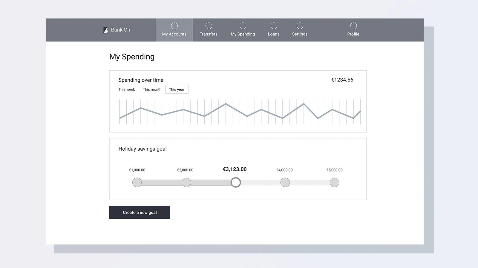
We received a series of basic wire frames for each break point / device containing essential aspects of the design & core features that had to be in place. In addition to this we were free to add our own innovative ideas & features.
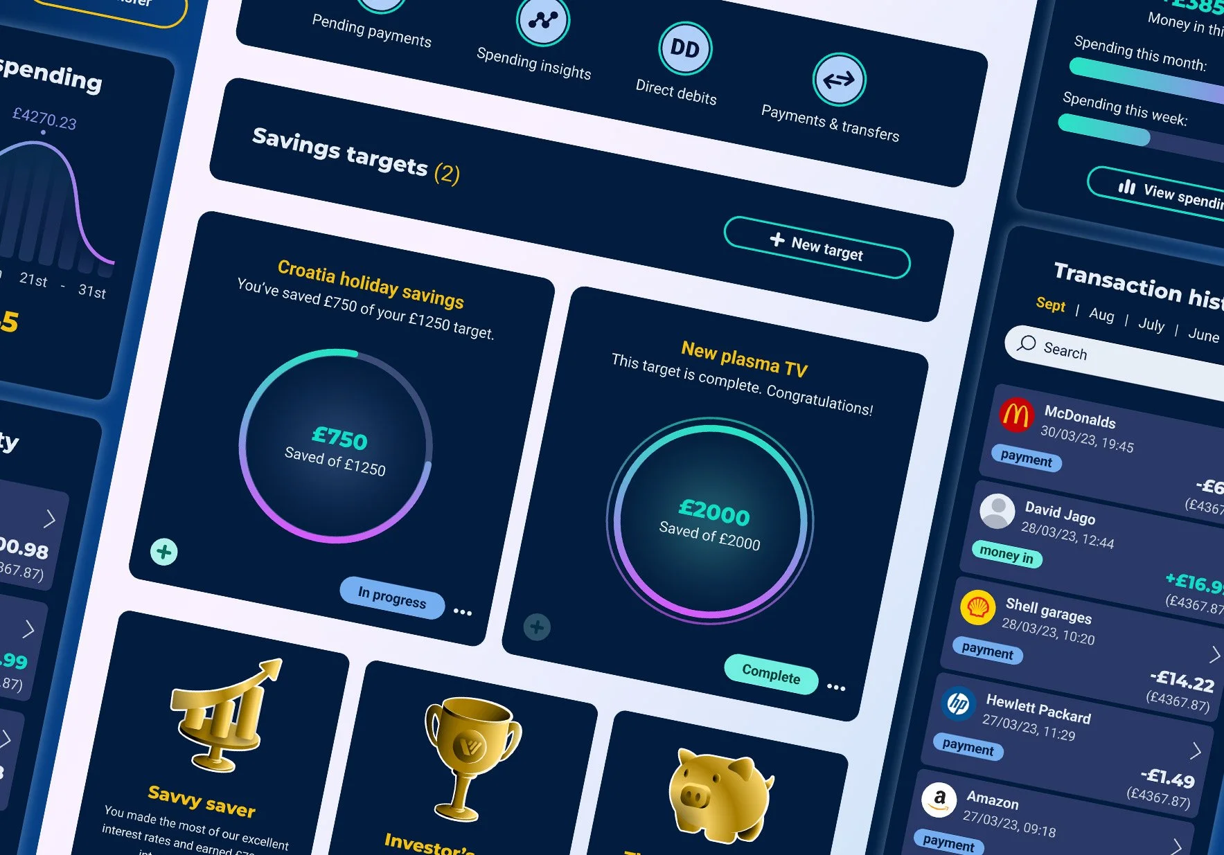
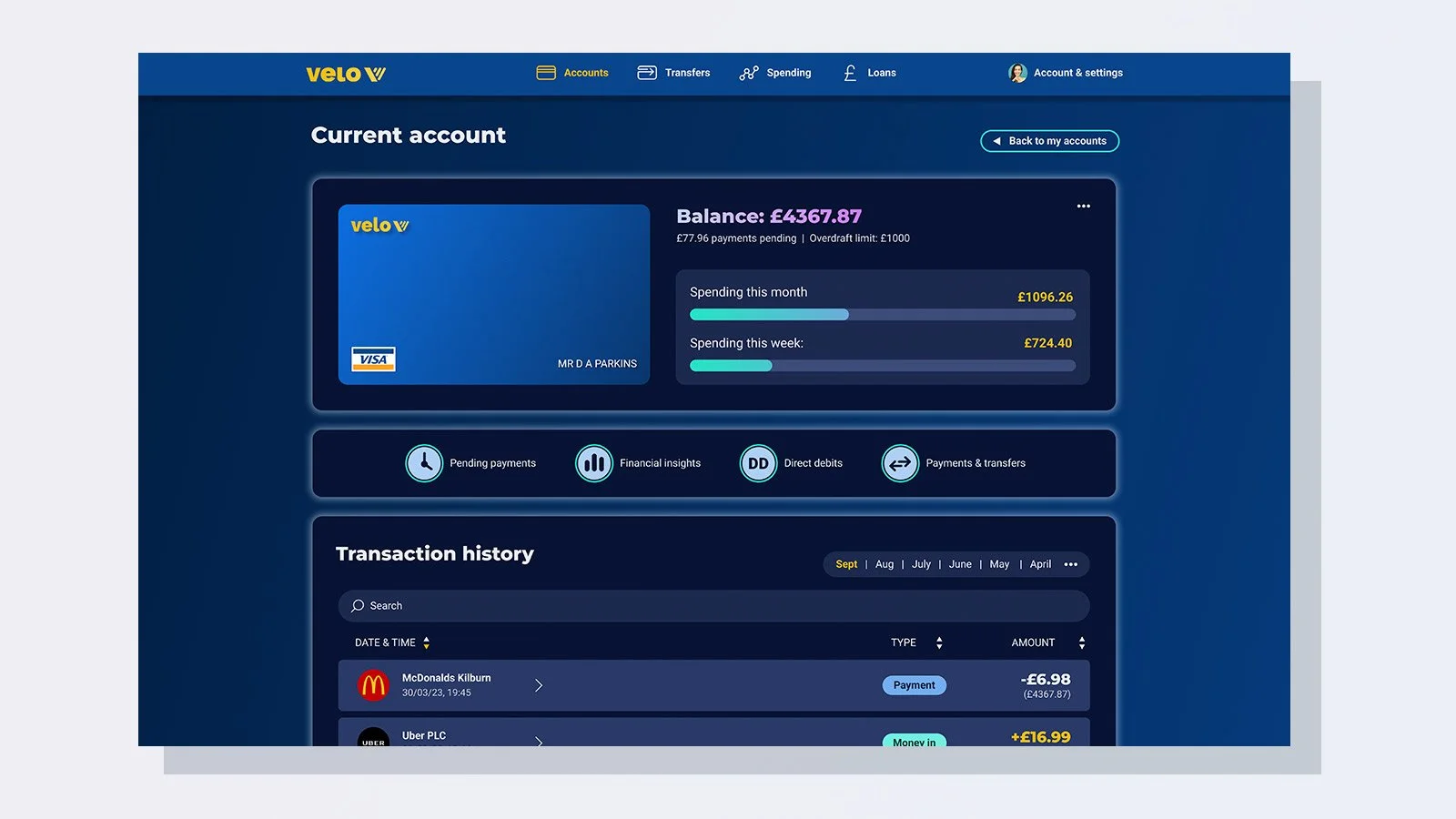
Insightful spending graphs & data
The Velo app would deliver useful graphs, giving users a top-down view of their spending, as well as additional financial data providing insights into their buying habits.
Gamification to encourage good habits
I added additional features that provided light gamification, designed to motivate users to save, accrue interest & hit personal financial goals.
Personal savings goals
The application would also allow the user to create individual savings targets, letting them build up pots of money towards things like holidays, cars & appliances.
-
![]()
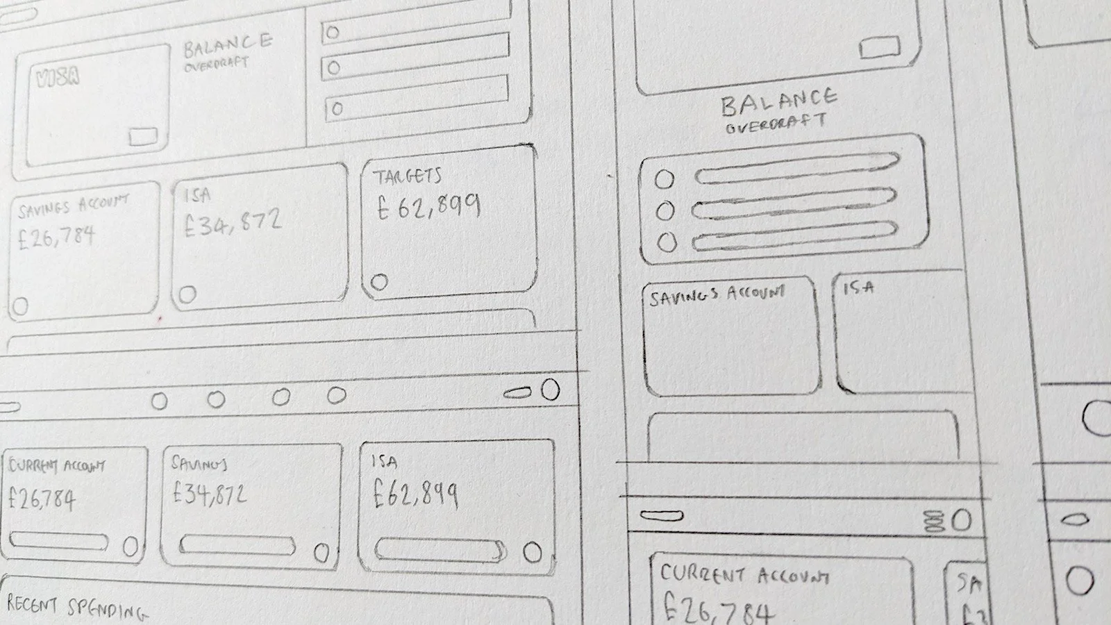
Sketches & scamps
After receiving the brief & stipulations for features & content I began by sketching out ideas for a range of different approaches to the layout, with sliding cards & a modular design.
-
![]()
Wire frames
Wire frames established the core features that must be present on each page of the application. Using these as the master frame work, I began infusing them with ideas from my sketches.
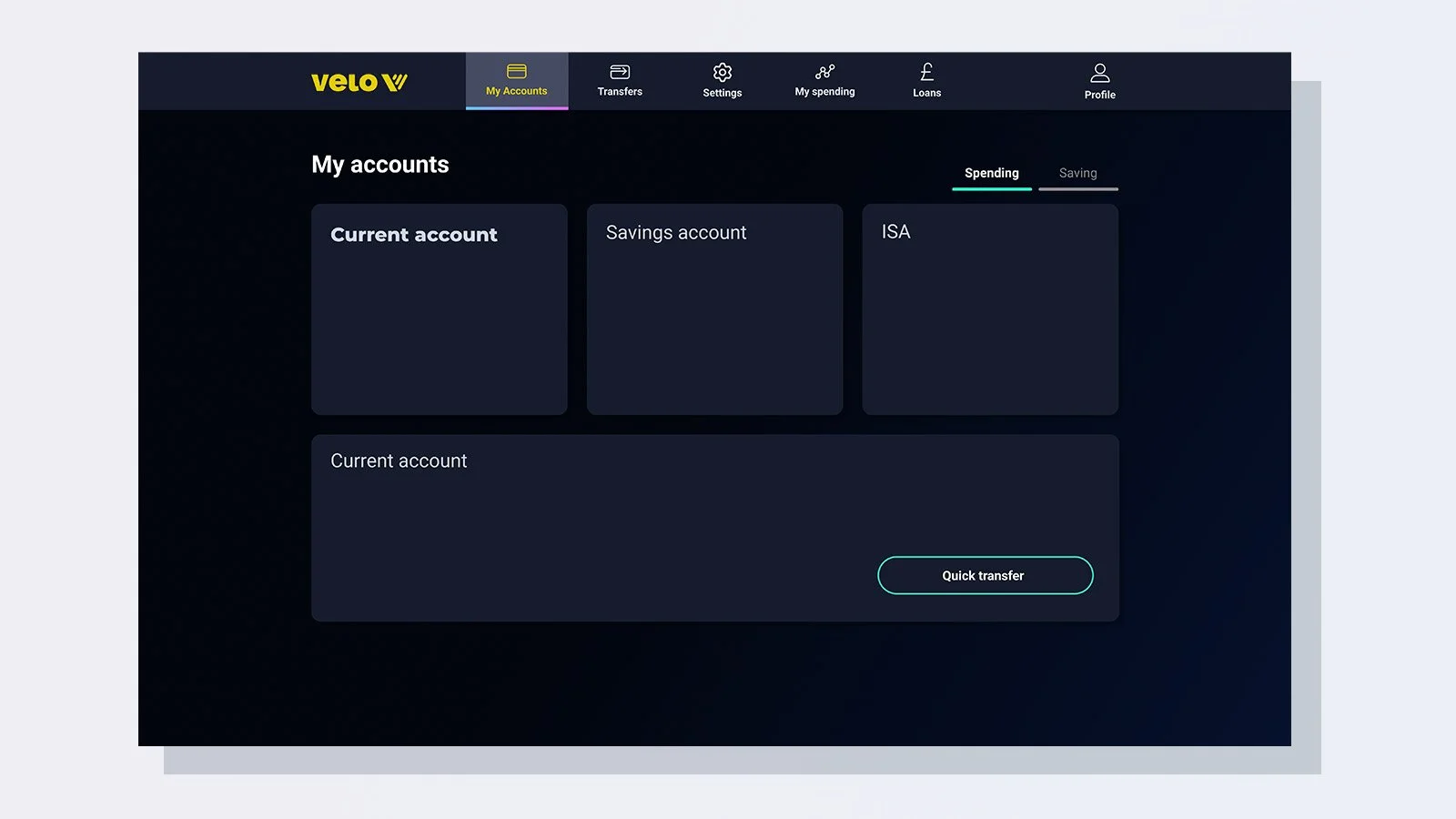
3: Final designs

Colour palette
For this project I wanted to use a dark theme. I used shades of dark blue to form a core component of the visual identity, feeling strong & dependable. To inject playfulness & character to the designs, I opted for vibrant candy-like colours as accents, & yellow for the main brand.

Font choices
It was important I chose fonts that were easy to read & tonally appropriate, but project some personality. I settled on the pairing of Roboto for main body fonts & montserrat for headers, which I felt achieved a perfect harmony between these mandates.

Design system
I created a design system & library of components, featuring interactive states for elements such as buttons, transaction modules & charts. I used an 8-pixel grid to determine spacing scales & sizing of elements. (8,16, 24, 32 etc)
4: Outcomes

I passed the UX institute’s course with the highest grade & gained professional certification in user interface design.
I was told during group feedback sessions that my research into styles, colours & UI references had “set the bar” for other students.
I satisfied all aspects of the assignment & created something with a genuinely unique style that stood out from the crowd.
Reflections
With this assignment I wanted to challenge myself by designing a dark themed app which also delivered vibrant playful elements. I felt that avoiding more obvious routes would result in a more interesting product that stood out from the crowd.
This meant more iterations & refinements to the design & colour palette were required, but ultimately, I was able to deliver the project ahead of the assigned time-frame, achieving an excellent result.
